Home > Re-Covered: Meet the designer behind the bold new look
Re-Covered: Meet the designer behind the bold new look
 The Cowboy and the Vampire Collection gets an upgrade, including new covers with western gothic flair
The phrase “you can’t judge a book by its cover” is a lie. It’s a damn lie. People do it all the time. And to turn the browsing impulse into a buying impulse, authors need a trained designer on their side.
The internet and many bookstores have plenty of examples of poorly designed covers that are sometimes not just off-putting, but downright laughable. One of the biggest mistakes writers — people who make their living with words — make is thinking they have full access to the unique visual language of design arts. Sure, there are some rare exceptions, but we are not among them, and we have a dustbin full of poorly designed crimes against design-ity to back that up.
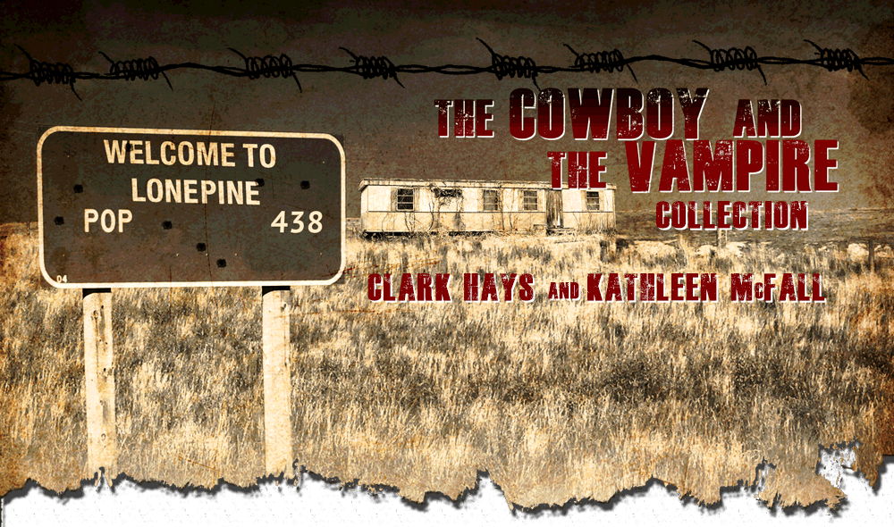
As we got closer to releasing The Cowboy and the Vampire: Rough Trails and Shallow Graves, we wanted to “rebrand” the first two books in The Cowboy and the Vampire Collection and we were lucky enough to connect with talented local artist and designer Aaron Perkins. He designed some exceptional and powerful covers, and was kind enough to share a little about himself and the work that went into our new covers.
Aaron, tell us a little about yourself. I was born and raised in Findlay, Ohio, in the aftermath of a blizzard, then went to college and graduated from the School of Advertising Art (in Kettering, Ohio) and then graduated from Portland State University.
How did you come to be an artist? I have been drawing since I can remember. My mother still has drawings she saved of mine from when I was a kid and I now have some of them stowed away in my garage. As a teen, I thought about going into comic book illustration (Batman is my fave character), but realized my chops weren’t quite there. Then I discovered graphic design/communication and realized I appreciated that medium as well. So I went into that. I still enjoy dabbling in the finer arts though, painting, drawing, photography. All of those areas influence and inspire me in some fashion. Plus graphic design draws on those skills as well.
How does art turn into design? Art and design for me are interchangeable. Design is a little more calculated or planned, in some ways geared toward a specific effect or message. It’s still a subjective medium, but it requires really understanding color theory, flow of elements, balance, etc., just like your basic drawing and composition skill sets. When I design a poster, for example, I take into consideration the type hierarchy, along with the graphic elements and how they play together as a whole, while still considering the basic composition of the piece.
You’re in the military, and you do design work for the Air National Guard.  Tell us a little about that. After I finished high school, I went into the US Army for three years and was stationed in Kitzingen, Germany, where I was in the Air Defense Artillery branch as a radar operator. In the Army, I still sketched and drew. My six month deployment to Tuzla, Bosnia-Herzegovina, allowed me to sketch little portrait caricatures of the guys in my platoon in a log book we used on guard duty. Needless to say it got some good laughs. A fellow platoon-mate has that log book to this day, much to my and a good friend of mines’ chagrin. After my three years was done, I came back to the states and went to college. When I moved to Portland, Ore., I joined the Oregon Air Guard (142nd Fighter Wing) where I work as a public affairs / graphic communications specialist. I get to do a variety things — photography, video production, writing and web and print graphic design. It is all communications, and our department is the “public voice” of the unit, whether that is written or visual communications.
Other than having excellent creative direction from the authors, what was the process like for The Cowboy and the Vampire Collection? Very easy! Luckily meeting in person before starting to hash out ideas helped to really get the final product to fruition. The final concept came about by NOT doing what had already been over-done, in my opinion, and one shared by the authors — romance fluff with half-naked women with fangs. We both had ideas of simple, somewhat symbolic imagery that boiled the main themes of each book down into one stark image. The style of the covers came about when I thought about the old west, and old textures that came into my head — burlap bags, old parchment paper, gritty imagery. Then for the main theme graphic, making it illustrated-like, meshed with a burnt, branded look to it.
Who is your biggest influence as a designer, and why? That’s a tough question. Honestly, too many. However I do appreciate some old fine artists such as Gustav Klimt, Modigliani. Art deco and nouveau movements, abstraction expressionism, surrealism. I’m also a big fan of concert poster art. Dave McKean is a designer, illustrator, photographer whose work is inspiring to me. His work is kind of dark, but very beautiful in how he goes about it. He does a lot of mixed media pieces.
Any other interesting projects on the horizon? I’ve been busy with my Air Guard gig designing coins and possibly another City of Honor nose art graphic which goes on an F15 fighter jet. And I have a event poster project with the Fox Tucson Theater in Arizona.
Aaron is available for similar projects, and we can attest to the fact that he is very reasonable, and you can contact him, and see more of his work, on his website.
